NBC News
NBC News App
A few points about the decision making process — by no means a complete list.
The Challenges
This brief case-study covers two different product launches — an overhaul of an antiquated system and the next release to add features users had been requesting.
The overhaul of the NBC News app involved a restructure of the stack, updates to the coding languages, new curation tools for editors and a new mobile API. The design language was updated to complement a news design system we called Bento. The restructure allowed editors greater flexibility for any storytelling situation while enabling content sharing between brands. Features users requested were prioritized and ad revenue opportunities added in to help keep the lights on.
Scope
Complete restructure of the tech stack, migration to modern coding languages, the introduction of new curation tools for editors, and a new mobile API. The design language was updated to align with NBC News' Bento design system.
Goals
- →Increase video starts and conversions
- →Boost video completion rates
- →Increase awareness of the full breadth of content and media types
- →Fully transition to the Bento Design System
- →Establish a flexible framework for future expansion and scale
Team
- Product Manager
- Creative Director
- 2 Designers
- 3 Engineers
- UX Researcher
- Mobile App Editor
The Actions
Highlight & promote NBCU's expansive video content library. Allow editorial to package contents thematically with flexible visual presentations using the new layout system. Provide convenient localization features for end-users. Build a brand-agnostic system that can be implemented across multiple properties.
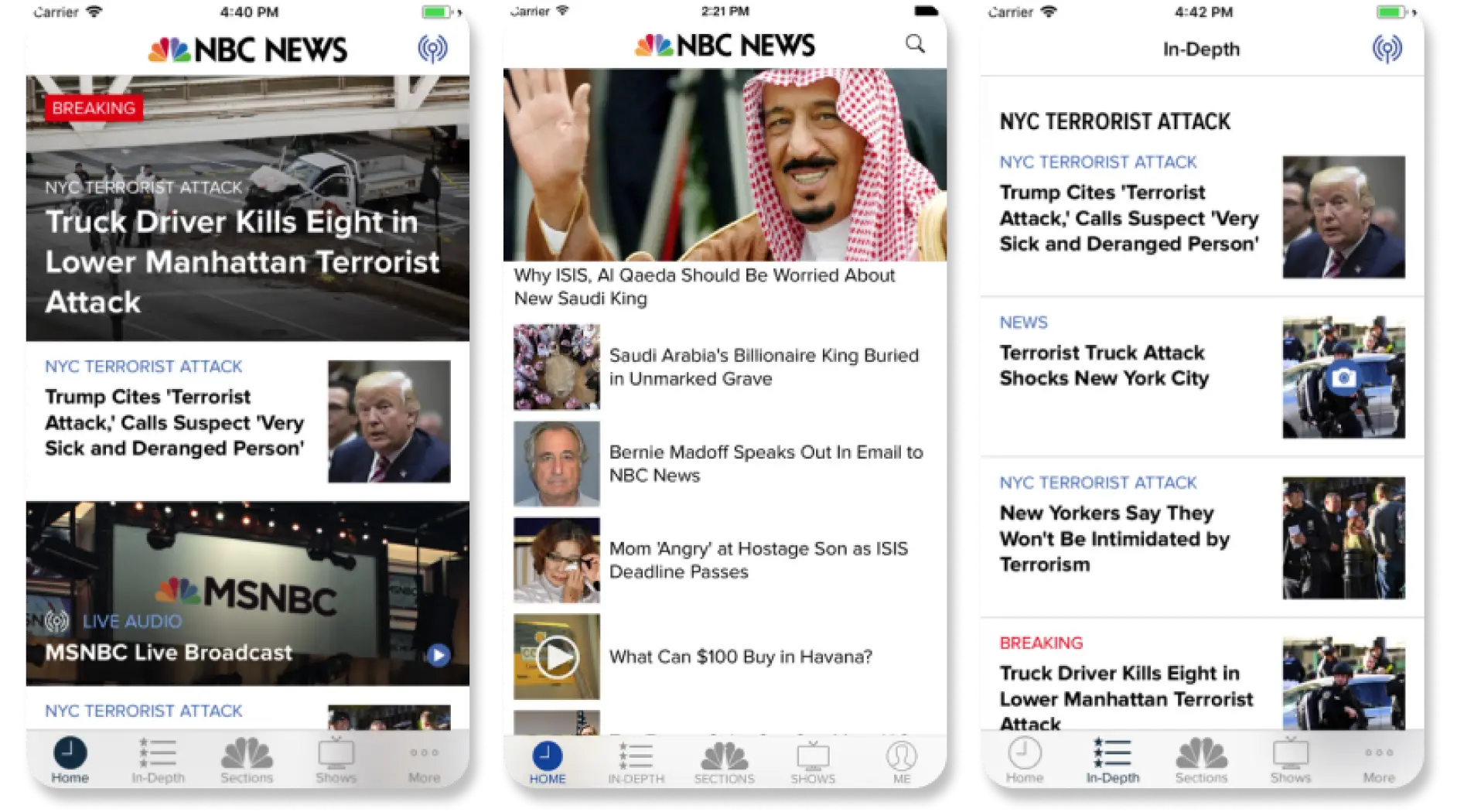
Before
- ·Editorial curations limited to a couple key areas
- ·2 page templates for information display
- ·Few entry points to video
- ·Dated design language
- ·No real marketing plan
- ·Limited revenue opportunities
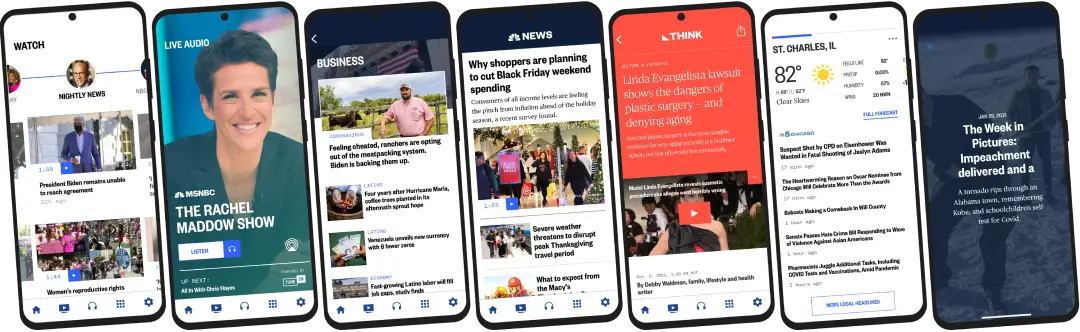
After
- ·Editorial flexibility with content, layout, and overwrites
- ·Multi-page templates to best showcase content types and enhance storytelling
- ·Featured videos with dedicated sections to represent shows and live coverage
- ·Design language and atomic system in sync with web and OTT platforms
- ·Marketing can key in on specific users, events, and topics
- ·Audio for broadcast shows and NOW channel
- ·Ads embedded in content, and as pre-, mid-, and post-roll in a new video player
The Plan
Ideation
A mature org knows that good ideas come from anywhere.
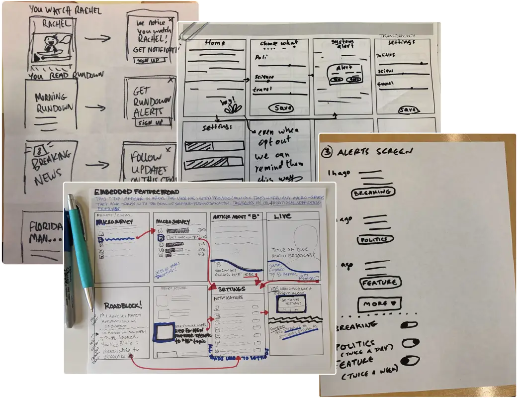
Multiple teams — product, marketing, engineering, data insights — gathered to pitch ideas, make sketches and kick off a direction we believed would have merit. The data insights team provided market research to help form our direction and resolve conflicting opinions.
The best of intentions
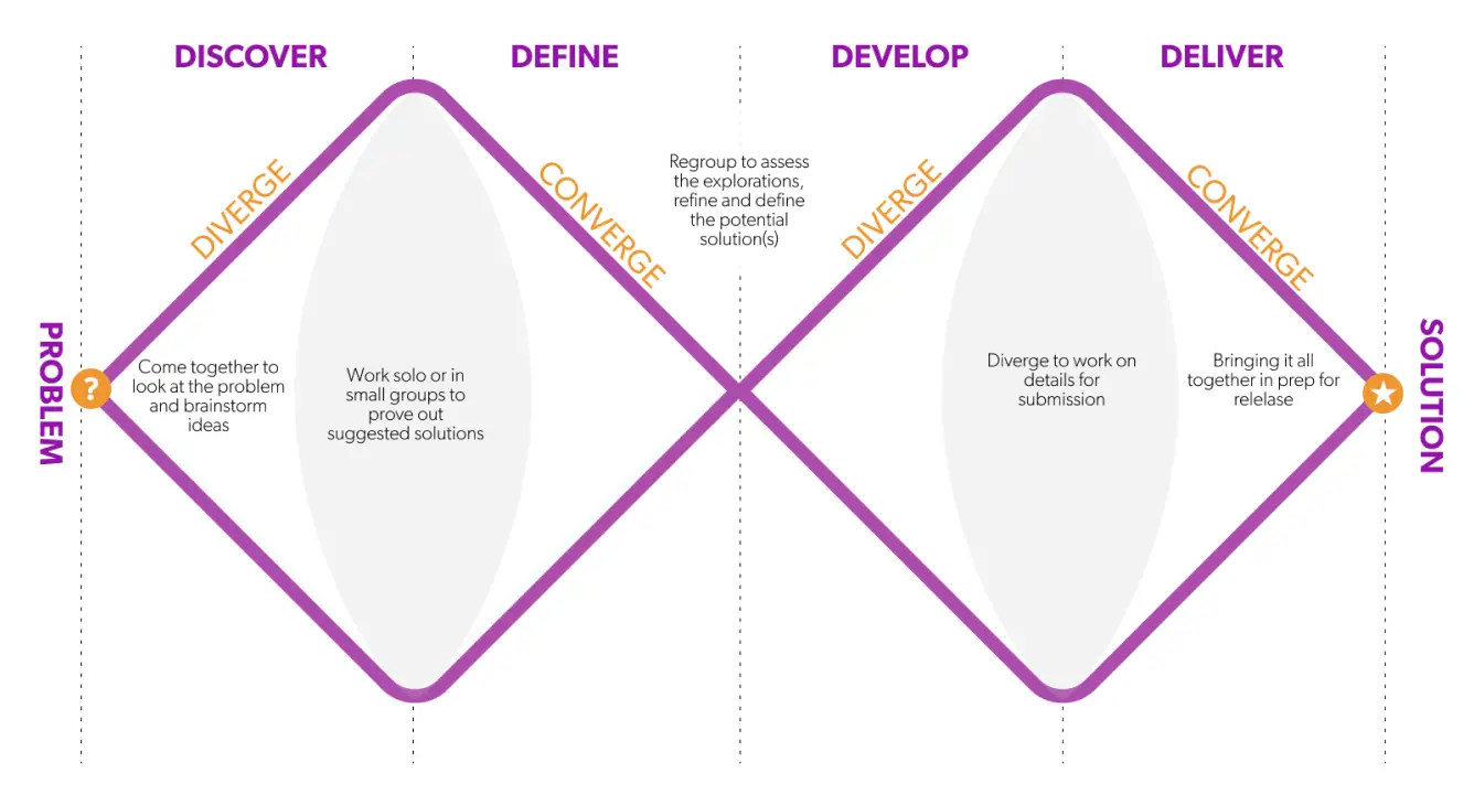
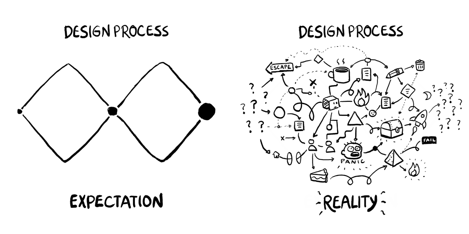
Our process was a version of the Google Design Sprint method combined with the Double Diamond design method from the British Design Council. Occasionally the process would turn slightly sideways (as interpreted here by Pablo Stanley of Blush Studios) which is totally fine too. Sometimes amazing ideas come out of initial chaos.
Reminders are good.
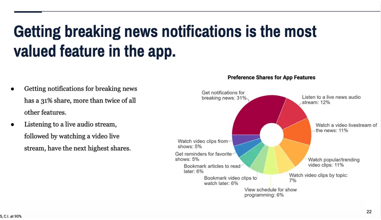
A good reminder from data insights was that breaking news is still the most important feature to be refined. It inspired thinking about notification cadence, frequency, and inboxing. It also helped us narrow our focus on a set of features that would have the most impact for this launch — live video, audio, localization.
Present, not persistent
When mobile users are facing notification burnout, how do you determine which breaking alerts are "important" vs. "vitally important"? I assessed the use cases for a variety of notifications, then sent those into testing and research to help define the limits of annoyance. A push service that specialized in geo-targeting and delayed sends kept the app alerts from being a nuisance. User preferences could also determine if they received the alert.

Pain Points
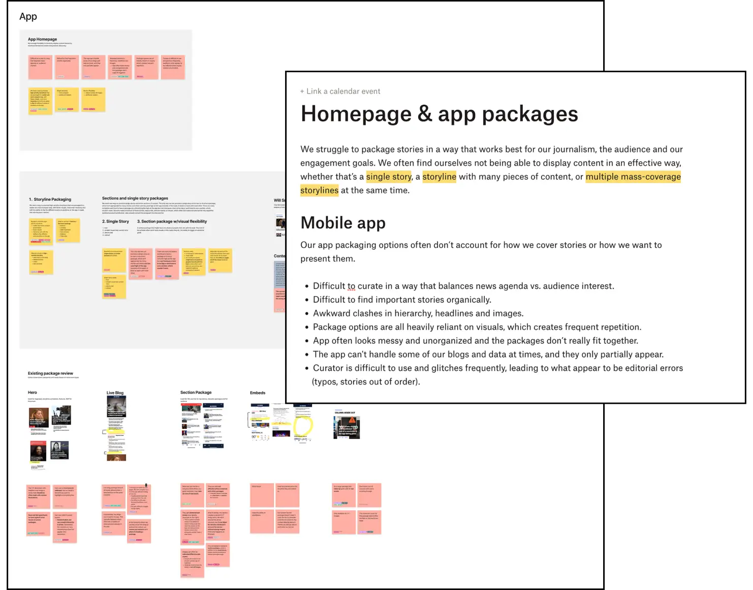
We interviewed editorial to learn what their current pain points were for the existing CMS. The list was massive, but it came down to layout flexibility, overwriting content (while retaining the originals) and selected automations.
Editorial Freedom
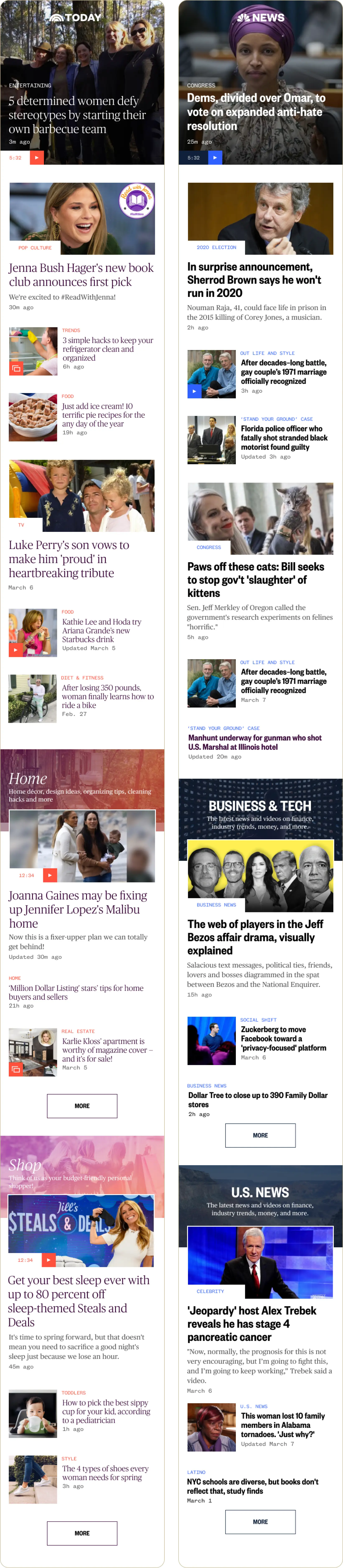
Layout packages were produced to give the editorial team easy, flexible methods for different news scenarios and tempos. Similar content types could be manually curated together for deep storytelling opportunities. Sections could remain fully or partially automated to ensure the content was always fresh with limited editorial lift.
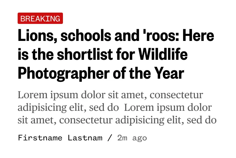
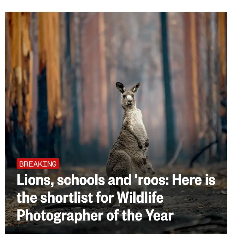
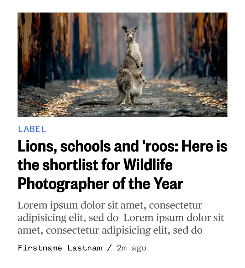
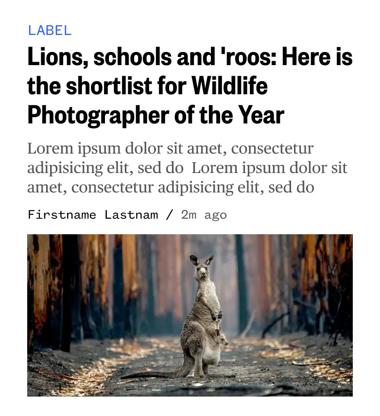
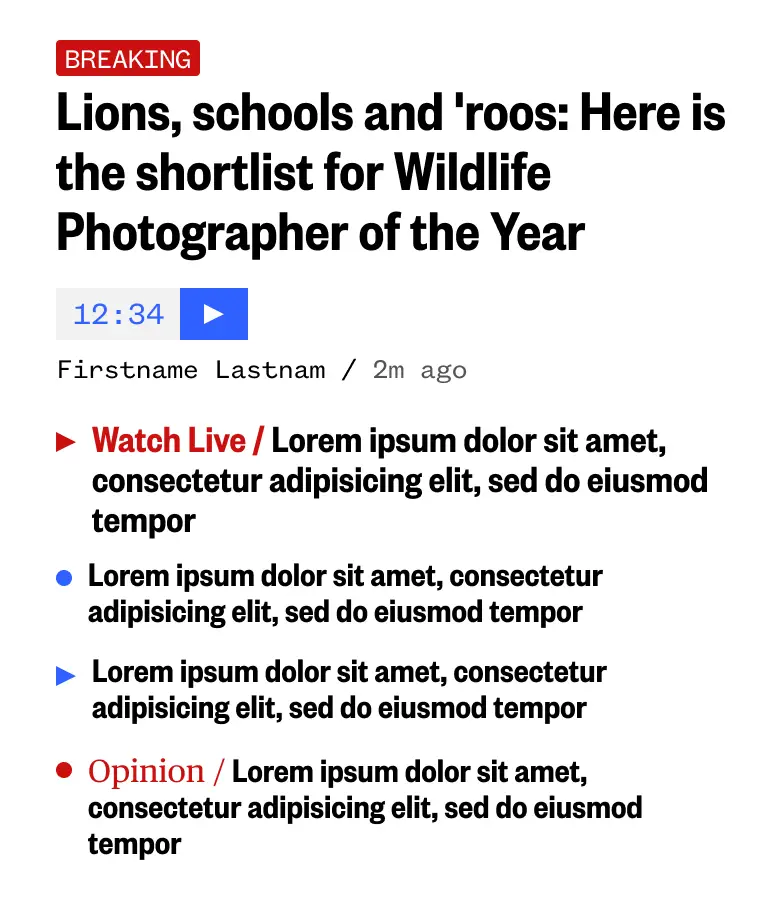
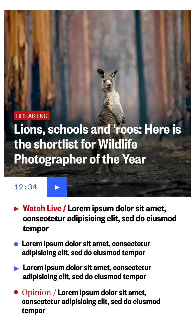
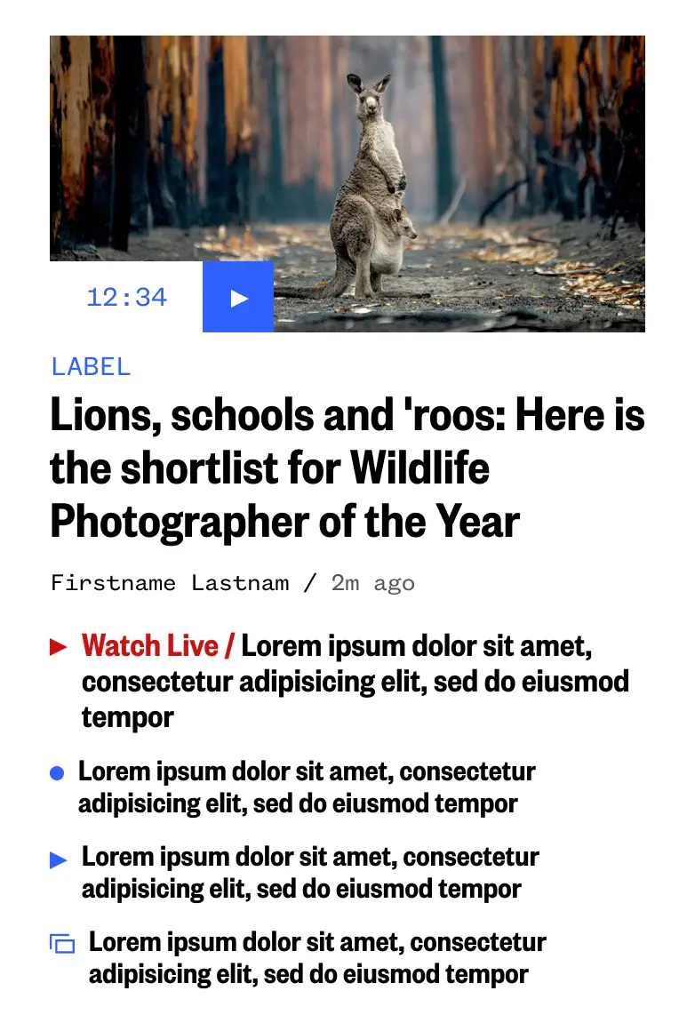
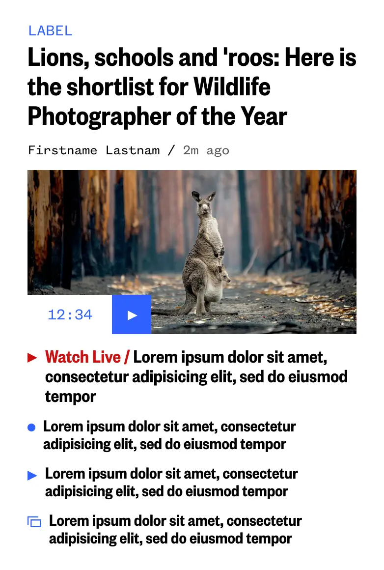
Examples of how image size and repeatable elements can set hierarchy.
Wires & Proofs
I set up the image ratio list and samples of how the images were used in various components. This was presented to the editorial team to ensure we had enough flexibility within each set of components. We were advised by the art department that the image ratios we included would fit their storytelling needs.
Mobile CMS
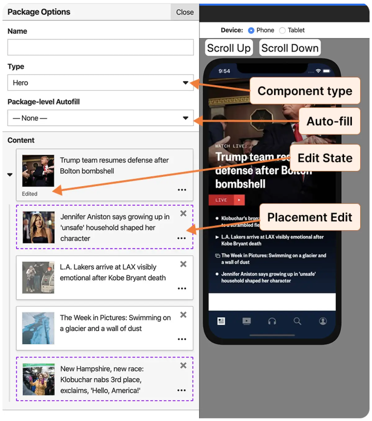
Internal tools were built for the mobile app — none existed previously when 90% of the content was auto-fed by mobile APIs. The new internal CMS allowed editors to change layouts, overwrite copy, reorder and pin, and choose whether a component would be auto-fed or 100% manually curated.
User Testing
We tested across TODAY Show and NBC News app users. 78% of News app users responded overwhelmingly positively with the increased video access, and 62% were very satisfied that they could find everything about a storyline in one place. Both cohorts appreciated bigger images and better organization.
Users very regularly (in this case 87%) request customization and personalization. In future releases we began adding points of active personalization, and found that <20% of users actually used it at all. With this knowledge, we opted for passive personalization using ID tokens, history, and activity.
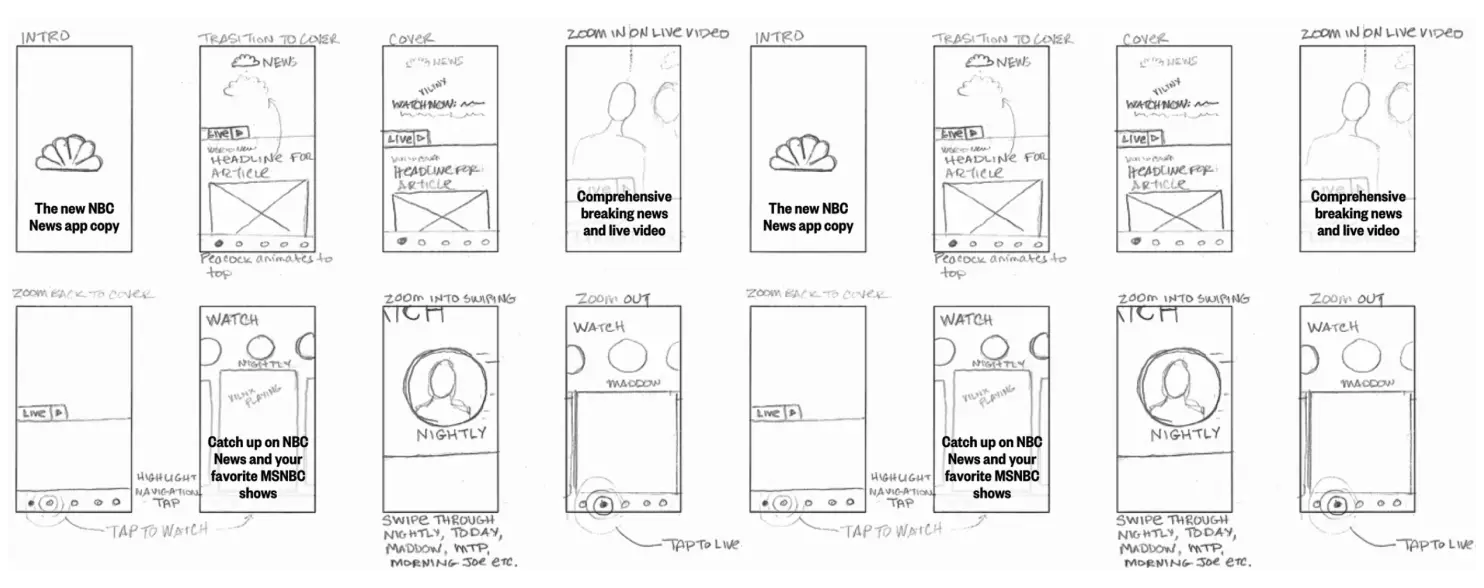
Marketing
Prior to the official launch we worked with Marketing and Brand teams to create a promotional sizzle reel. It was used at media events, with press releases, and as a Preview asset in the app stores.
The Results
+25%
Increase in average videos viewed per video visit in NBC News app
+51%
Video starts across the mobile app portfolio — from 9M to 13.6M
+20%
Increase in Monthly Active Users, from 920K to 1.1M
Showcase Video
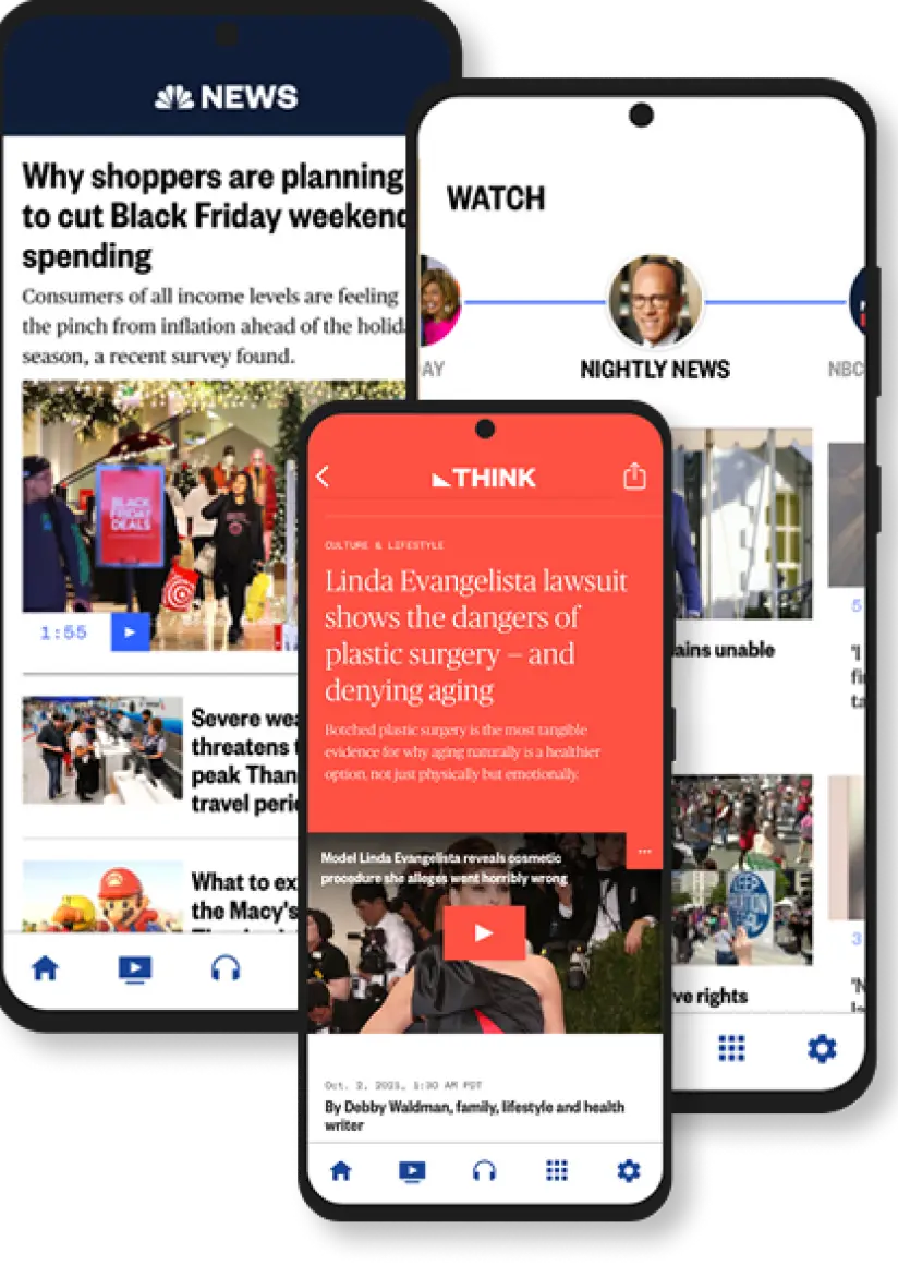
Elevated video with prominent placement on the home screen, while allowing articles, videos, live streams, and podcasts to coexist seamlessly. Users gained access to short-, medium-, and long-form video options, plus audio alternatives for when video viewing isn't ideal.
Scale to Brands
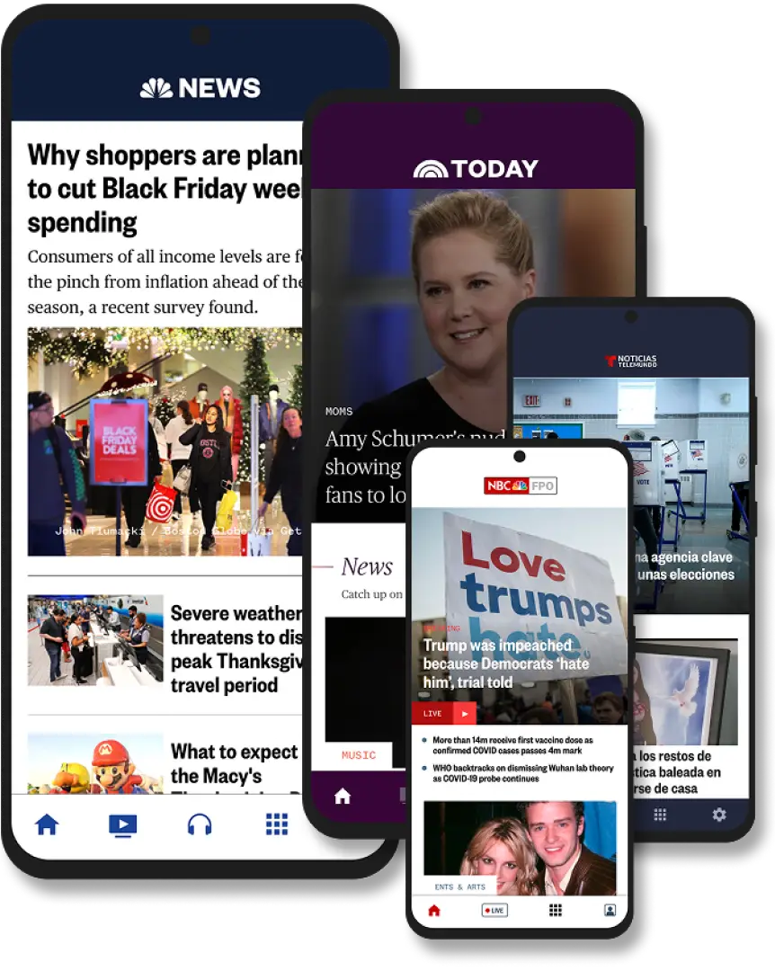
Everything we created was built to be brand-agnostic. The system was used to update the TODAY Show and Telemundo Noticias, and experiments were also done to show how Sky World News editorial and marketing teams might benefit from these updates.

Hello!

I'm Lisa Wilkins. I've spent 17+ years as a UX director, designer, and product strategist building things people actually want to use — across media, news, tech, and education at organizations like NBCUniversal, PragerU, and Microsoft. I live in the Sonoran Desert, which inspires me daily with its simplicity on the surface and complexity underneath. I'm adaptable, resilient, and nerdy: ask me about WCAG compliance or things equestian and you'll get the same enthusiasm. I'm most proud of raising a son full of gratitude and spoiling some very good horses.
Let's talk about what I can build with your team.